スタートページ> JavaScript> 他言語> Python 目次> ←ヒストグラム →相関・回帰直線・信頼区間・重相関
Python でグラフを作成するには、アドオンライブラリの Matplotlib を使います。
ここでは Matplotlib のコンポーネント matplotlib.pyplot を用います。
import matplotlib.pyplot as plt
Matplotlib 自体はデータの加工機能はもっていませんので、NumPy も使います。
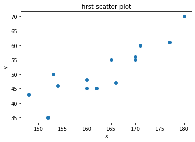
下記の青線の部分をGoogle Colaboratryの「コード」部分にコピーアンドペースト(ペーストは Cntl+V)して実行すれば、右図の画像が表示されます。
  ax.scatter(x, y, options)
      x, y                 # 点(x,y)の組 必須 list でも ndarray でも可
      options:
          marker='o'       # マーカーの形
                             # .点 ,四角点 o〇 v▽ ^△ s□ *☆ ++ x× &x$(文字x)
          c='r'            # マーカーの色
                             # b(Blue) g(Green) r(Red) c(Cyan) m(Magenta) y(Yellow) k(Black) w(White)
          alpha=0.7        # 透明度
          s=100            # マーカーのサイズ 100以上にするとよい
          edgecolors='b'   # マーカーの縁線の色
          linewidths=2     # マーカーの縁線の太さ
import numpy as np
import matplotlib.pyplot as plt
# 入力データ
x = [180,170,162,171,160,165,148,153,170,154,160,166,177,152]
y = [ 70, 55, 45, 60, 45, 55, 43, 50, 56, 46, 48, 47, 61, 35]
# ax 設定
fig = plt.figure()
ax = fig.add_subplot(1,1,1)

# 散布図作成
ax.scatter(x, y)       # 棒グラフや折線グラフと違うのはここだけ

# 図の体裁  タイトルやラベルに日本語は使えません
ax.set_title('first scatter plot') # グラフのタイトル
ax.set_xlabel('x')                 # X軸のラベル
ax.set_ylabel('y')                 # Y軸のラベル
# 表示
fig.show()
import numpy as np
import matplotlib.pyplot as plt
# 入力データ
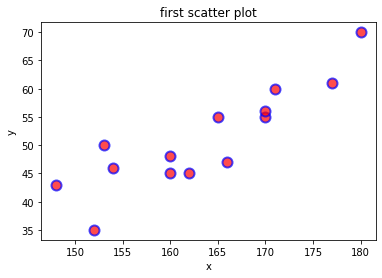
x = [180,170,162,171,160,165,148,153,170,154,160,166,177,152]
y = [ 70, 55, 45, 60, 45, 55, 43, 50, 56, 46, 48, 47, 61, 35]
# ax 設定
fig = plt.figure()
ax = fig.add_subplot(1,1,1)
# 散布図作成
ax.scatter(x, y,
marker='o', # マーカーの形は円
c='r', # 円の内部は赤
alpha=0.7, # 透明度
s=100, # マーカーのサイズ
edgecolors='b', # マーカーの縁線の色
linewidths=2) # マーカーの縁線の太さ
# 図の体裁
ax.set_title('first scatter plot') # グラフのタイトル
ax.set_xlabel('x') # X軸のラベル
ax.set_ylabel('y') # Y軸のラベル
# 表示
fig.show()
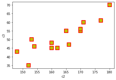
 2つの形式があるが、パラメタ機能はほぼ同じ

  df.plot(kind='scatter', x=列名, y=列名, options)
  df.plot.scatter(x=列名, y=列名, options)
      x, y                 # 点(x,y)の組 x='c2', y='c3' など
      options
          ax.scatter とほぼ同じ
          「グラフ 棒グラフ・折線グラフ df.plot の主要なパラメタ」(array-bar-plot)参照
c2列をx、c3列をyとした例
import numpy as np
import matplotlib.pyplot as plt
import pandas as pd         # df を使うので必要
df = pd.DataFrame([
                   ['A', 'M', 180, 70, 86],
                   ['A', 'M', 180, 70, 86],
                   ['B', 'M', 170, 55, 84],
                   ['C', 'F', 162, 45, 85],
                   ['D', 'M', 171, 60, 84],
                   ['E', 'F', 160, 45, 83],
                   ['F', 'M', 165, 55, 82],
                   ['G', 'F', 148, 43, 74],
                   ['H', 'F', 153, 50, 81],
                   ['I', 'M', 170, 56, 82],
                   ['J', 'F', 154, 46, 82],
                   ['K', 'M', 160, 48, 76],
                   ['L', 'F', 166, 47, 75],
                   ['M', 'M', 177, 61, 83],
                   ['N', 'F', 152, 35, 77]],
                  columns = ['c0','c1','c2','c3','c4'])
fig = plt.figure()

ax = df.plot.scatter(x='c2', y='c3',  # c2列をx、c3列をyとする
           marker = 's',      # マーカーの形 ax.scatter と同じ
           s = 150,           # マーカーのサイズ
           c = 'y',           # マーカーの色
           alpha = 1.0,       # 透明度
           linewidth = 2,     # 縁線の太さ
           edgecolor = 'r',   # 縁線の色
          )

fig.show()
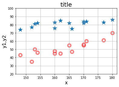
x-y1 の図と x-y2 の図の2つの図を描きます。
import numpy as np
import matplotlib.pyplot as plt
# 入力データ
x  = [180,170,162,171,160,165,148,153,170,154,160,166,177,152]
y1 = [ 70, 55, 45, 60, 45, 55, 43, 50, 56, 46, 48, 47, 61, 35]
y2 = [ 86, 84, 85, 84, 83, 82, 74, 81, 82, 82, 76, 75, 83, 77]
# ax 設定
fig = plt.figure()
ax = fig.add_subplot(1,1,1)

# 散布図作成           x-y1 と x-y2 の二つの散布図を描く
ax.scatter(x, y1,
           marker = 'o',      # マーカーの形
           s = 100,           # マーカーのサイズ
           c = 'w',           # マーカーの塗りつぶしの色
           alpha = 0.5,       # 透明度
           linewidth = 4,     # 縁線の太さ
           edgecolor = 'r'    # 縁線の色
          )
ax.scatter(x, y2,
           marker = '*',
           s = 200
          )

# 図のデザイン(ax でのオプション)  棒グラフや折線グラフと同じ
ax.set_ylim(20,100)
ax.set_title('title', fontsize=20)
ax.set_xlabel('x',     fontsize=16)
ax.set_ylabel('y1,y2', fontsize=16)
ax.grid()
# 表示
fig.show()
x の各点に対応する z があり、'M'あるいは 'F'の値が入っているものとします。
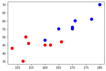
x-y の散布点について、対応する z の値が 'M' なら 'b'(青点)、'F' なら 'r'(赤点)にします。
x,y は list でも ndarray でもよいのですが、z は記述を容易にするために ndarray にしておきます。
z の 'M' → 'b'、'F'→ 'r' に置換した配列 iro を生成し、color=iro とします。
import numpy as np
import matplotlib.pyplot as plt
x = [180,170,162,171,160,165,148,153,170,154,160,166,177,152]
y = [ 70, 55, 45, 60, 45, 55, 43, 50, 56, 46, 48, 47, 61, 35]

# 置換式を簡単にするため、z を ndarray にする。
z = np.array(['M','M','F','M','F','M','F','F','M','F','M','F','M','F'])
iro = np.where(z=='M', 'b','r')           # 置換:M → b, F → r

# ax 設定
fig = plt.figure()
ax = fig.add_subplot(1,1,1)

# 散布図作成
ax.scatter(x, y,
           c=iro,       # 各点が 'b' か 'r' になる
           s=100)
# 表示
fig.show()
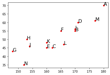
各点に次の名称をつけて表示したいのです。
z = ['A','B','C','D','E','F','G','H','I','J','K','L','M','N']

marker = z とできればよいのですが、marker はスカラーでなければなりません。
姑息な方法ですが、ax.scatter とか別途に
   「点(x[i], y[i]) に z を表示する」
ことにより解決します。

次の2行で記述します(説明省略)。
  for i, txt in enumerate(z):
      ax.annotate(txt, (x[i], y[i]))
import numpy as np
import matplotlib.pyplot as plt
x = [180,170,162,171,160,165,148,153,170,154,160,166,177,152]
y = [ 70, 55, 45, 60, 45, 55, 43, 50, 56, 46, 48, 47, 61, 35]
z = ['A','B','C','D','E','F','G','H','I','J','K','L','M','N']
# ax 設定
fig = plt.figure()
ax = fig.add_subplot(1,1,1)

# 散布図作成
ax.scatter(x, y,
           marker='o',
           c='r',
           s=20)
for i, txt in enumerate(z):                  # 各点の名称表示
    ax.annotate(txt, (x[i], y[i]), size=16)  # 点の右上に表示されます。

# 表示
fig.show()
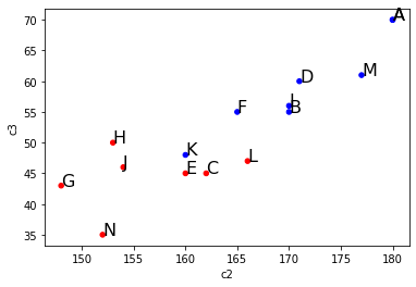
x→c2列、y→c3列、「グループによる点の色区分」でのz→c1列、 「各点の名称表示」でのz→c0列とします。
import numpy as np
import matplotlib.pyplot as plt
import pandas as pd
df = pd.DataFrame([
                   ['A', 'M', 180, 70, 86],
                   ['A', 'M', 180, 70, 86],
                   ['B', 'M', 170, 55, 84],
                   ['C', 'F', 162, 45, 85],
                   ['D', 'M', 171, 60, 84],
                   ['E', 'F', 160, 45, 83],
                   ['F', 'M', 165, 55, 82],
                   ['G', 'F', 148, 43, 74],
                   ['H', 'F', 153, 50, 81],
                   ['I', 'M', 170, 56, 82],
                   ['J', 'F', 154, 46, 82],
                   ['K', 'M', 160, 48, 76],
                   ['L', 'F', 166, 47, 75],
                   ['M', 'M', 177, 61, 83],
                   ['N', 'F', 152, 35, 77]],
                  columns = ['c0','c1','c2','c3','c4'])
fig = plt.figure()
iro = np.where(df.c1 == 'M', 'b', 'r')   # iro はサイズが行数のベクトル M → b, F → r
ax = df.plot.scatter(x='c2', y='c3', color=iro)
for i, txt in enumerate(df.c0):                     # 各点の名称表示
    ax.annotate(txt, (df.c2[i], df.c3[i]), size=16) # 点の右上に表示されます。
fig.show()
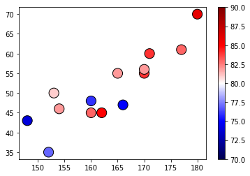
カラーマップとは、点x,yに対応する特性値 z の値を色のグラジュエーションとした縦長の色付きのバー(下図の右側)で表して、散布点のマーカーをその特性値に対応した色にすることです。
  ax.scatter(x, y, options)
      x, y                 # 点(x,y)の組
      options:
          marker='o'       # マーカーの形
          c='r'            # マーカーの色 これは指定できない(下の★が有効になる)
          alpha=0.7        # 透明度
          s=100            # マーカーのサイズ
          edgecolors='b'   # マーカーの縁線の色
          linewidths=2     # マーカーの縁線の太さ
                    # カラーマップを用いるときのオプション
          c=数値           # ★点の色を決める値。点の個数と同じサイズの配列 特性値 z
          cmap             # カラーマップ 'RdYlBu’'seismic' 'PRGn' など特定のグラジュエーションに限定
                           # 参照;https://matplotlib.org/3.1.3/tutorials/colors/colormaps.html
          vmin, vmax       # 正規化時の最大、最小値
          norm             # 正規化を行う場合の Normalize インスタンスを指定

  cm = plt.cm.get_cmap('seismic')  # グラデュエーションの設定(ax.cm.~ではエラー)
  fig.colorbar(mappable, ax=ax)    # カラーバーの表示(ax.colorbar ではエラー)
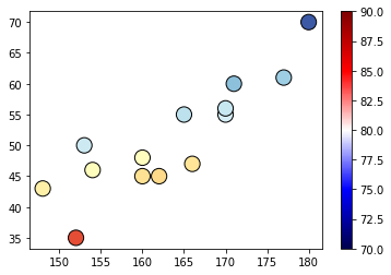
import numpy as np
import matplotlib.pyplot as plt
x = [180,170,162,171,160,165,148,153,170,154,160,166,177,152]
y = [ 70, 55, 45, 60, 45, 55, 43, 50, 56, 46, 48, 47, 61, 35]
z = [ 86, 84, 85, 84, 83, 82, 74, 81, 82, 82, 76, 75, 83, 77]
# ax 設定
fig = plt.figure()
ax = fig.add_subplot(1,1,1)

# カラーマップ
cm = plt.cm.get_cmap('seismic')  # グラデュエーションの設定
fig.colorbar(mappable, ax=ax)    # カラーバーの表示

# 散布図作成
mappable = ax.scatter(x, y,       # 散布図の結果を受け取る(mappable の名称は任意)
                      s=200,      # マーカーのサイズ
                      linewidth = 1,
                      edgecolor = 'k',
                      cmap=cm,    # カラーバーの色
                      c=z,        # 点の色を決める指標
                      vmin=70,    # cmap での c 最小値(z の最小値)
                      vmax=90     # 最大値
                     )
# 表示
fig.show()
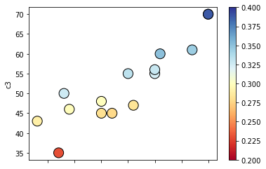
y/x の値を色指標とする。
import numpy as np
import matplotlib.pyplot as plt
# 入力データ(c2 と c3 の間で計算するので ndarray にした)
x = np.array([180,170,162,171,160,165,148,153,170,154,160,166,177,152])
y = np.array([ 70, 55, 45, 60, 45, 55, 43, 50, 56, 46, 48, 47, 61, 35])
# ax 設定
fig = plt.figure()
ax = fig.add_subplot(1,1,1)

# カラーマップ
cm = plt.cm.get_cmap('RdYlBu')
fig.colorbar(mappable, ax=ax)

# 散布図作成
mappable = ax.scatter(x, y,
                      s=200,
                      linewidth = 1,
                      edgecolor = 'k',
                      cmap=cm,
                      c=y/x,             # 色指標の計算
                      vmin=0.2,          # cmap での c 最小値
                      vmax=0.4           # 最大値
                     )
# 表示
fig.show()
x→c2列、y→c3列とします。
import numpy as np
import matplotlib.pyplot as plt
import pandas as pd
df = pd.DataFrame([
                   ['A', 'M', 180, 70, 86],
                   ['A', 'M', 180, 70, 86],
                   ['B', 'M', 170, 55, 84],
                   ['C', 'F', 162, 45, 85],
                   ['D', 'M', 171, 60, 84],
                   ['E', 'F', 160, 45, 83],
                   ['F', 'M', 165, 55, 82],
                   ['G', 'F', 148, 43, 74],
                   ['H', 'F', 153, 50, 81],
                   ['I', 'M', 170, 56, 82],
                   ['J', 'F', 154, 46, 82],
                   ['K', 'M', 160, 48, 76],
                   ['L', 'F', 166, 47, 75],
                   ['M', 'M', 177, 61, 83],
                   ['N', 'F', 152, 35, 77]],
                  columns = ['c0','c1','c2','c3','c4'])
fig = plt.figure()
cm = plt.cm.get_cmap('RdYlBu')
ax = df.plot.scatter(x='c2', y='c3',     # fig.colorbar(mappable, ax=ax) をこの中に組み込められる
                      s=200,             # ax.scatter と同じ
                      linewidth = 1,
                      edgecolor = 'k',
                      cmap=cm,
                      c=df.c3/df.c2,     # 色指標の計算
                      vmin=0.2,
                      vmax=0.4
                     )
fig.show()