スタートページ> JavaScript> 他言語> R言語
Rだけでも多様なグラフ作成機能をもっていますが、特に大量データを用いる統計分野では ggplot が便利で広く用いられています。
Rだけの作図機能と比較して、単純な操作でも、一応の体裁が得られること、作図してから追加的に改善するのが容易なことなどが挙げられます。
ここでは、あえて小さなデータを用いて、ggplot の基本的な処理を例示することを目的にしています。
ggplotでは、扱うデータはデータフレーム形式が標準になっています。多くのデータはリレーショナルデータベース、Excelのスプレッドシート、CSVファイルで流通しており、それらからデータフレームに取り込むのは簡単だからです。
library(ggplot2)

df <- data.frame(
          c1 = c("A", "B", "C", "D", "E", "F"), # X軸(質的)
          c2 = c( 2,  2.5,  5,   6,  6.5,  8),  # X軸(数的)
          c3 = c("P", "P", "Q", "P", "Q", "Q"), # クラス
          c4 = c( 4,  2,    6,   4,   5,   4),  # Y軸
          c5 = c( 5,  6,    4,   5,   3,   5))  # Y軸
library(ggplot2)        # ggplot2 を使うときに呼び出します

ggplot( … ) +          # キャンバスの設定、X・Y軸の変数の指定など
    geom_xxxx( … ) +   # geom_line():折線グラフ、geom_bar():棒グラフなどの関数でグラフ作成
    theme_yyyyt( … )   # 多様な補助関数を用いて体裁を整える

行末の + は「追加する」の意味で「改行」の機能ではありません。
1行で記述するときも ggplot( … ) + geom_xxxx( … ) のように記述します。
また、次のような記述により、複数のグラフを重ね描きができます。
複数の折線グラフなどは、このような方法で作成できます。
graph <- ggplot( … )   # 前のグラフ
graph + ggplot( … )    # 後のグラフが重ねられます。
ggplot(), ggplot(df), ggplot(df, aes())  # 灰色の正方形を表示
ggplot(aes(x))        # 灰色の正方形にX軸ラベルとX軸目盛りを表示、c1 ならば A, B, … になる
ggplot(aes(x, y))     # さらにX軸ラベルとX軸目盛りを表示

データフレーム(上述)のときは次のように記述できます。
ggplot(df, aes(c2))
ggplot(df, aes(c2, c4))

x, y はベクトルです。複数のyを持つグラフを作成するとき、
ggplot(aes(x, cbind(y1, y2)) のように行列で与えることはできません。

aes(Aesthetic mapping):グラフをプロットする際のx軸やy軸を決めたり、因子型のデータにおいてプロット時の色や形を決める時に使います。
次のように分離して記述できます
ggplot() + aes(x, y)
主要なグラフ
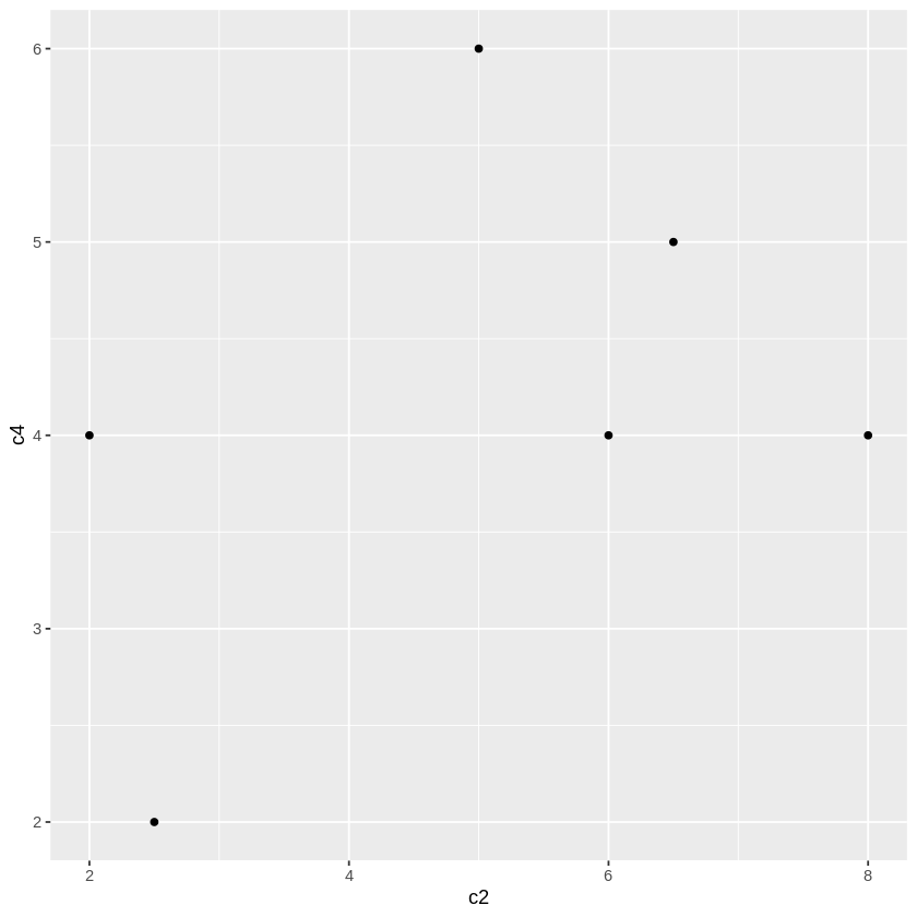
# geom_point():散布図。
ggplot(df, aes(c2, c4)) + geom_point() # 散布図
ggplot(df) + aes(c2, c4) + geom_point() # このような記述もできる(以下同様)
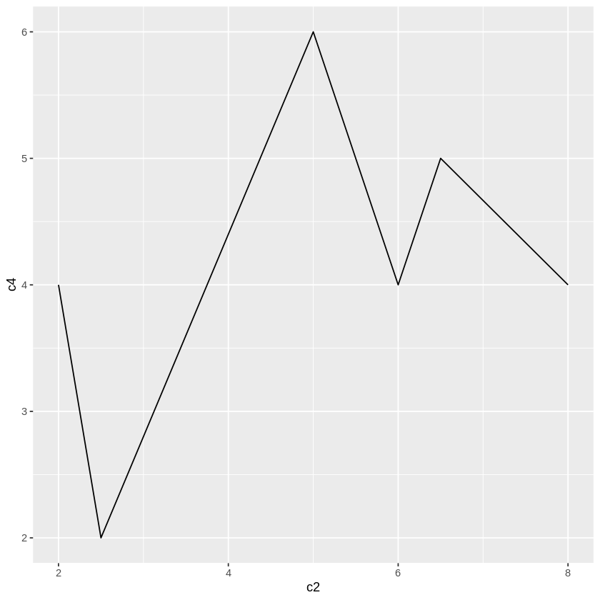
# geom_line():折れ線グラフ。
ggplot(df, aes(c2, c4)) + geom_line() # 折線グラフ
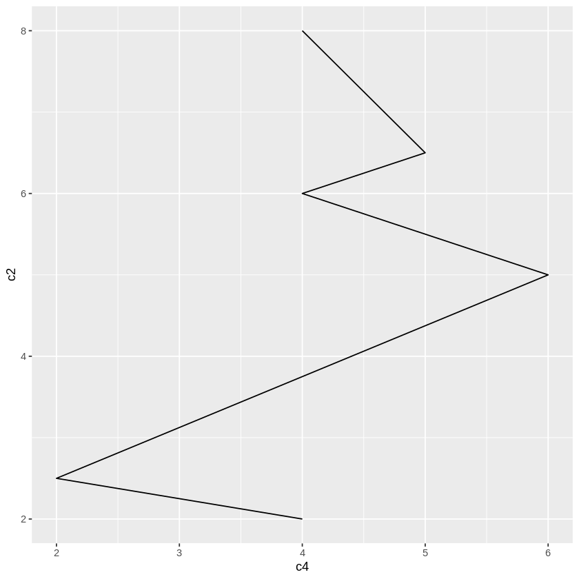
ggplot(df, aes(c2, c4)) + geom_line() + coord_flip() # 折線グラフ(縦・横交換)
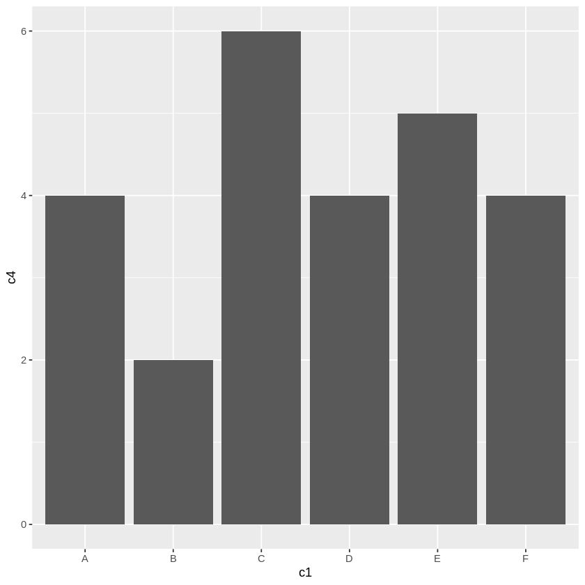
# geom_bar():棒グラフ。
ggplot(df, aes(c1,c4)) + # 棒グラフ
geom_bar(stat="identity") # stat="identity"は必須
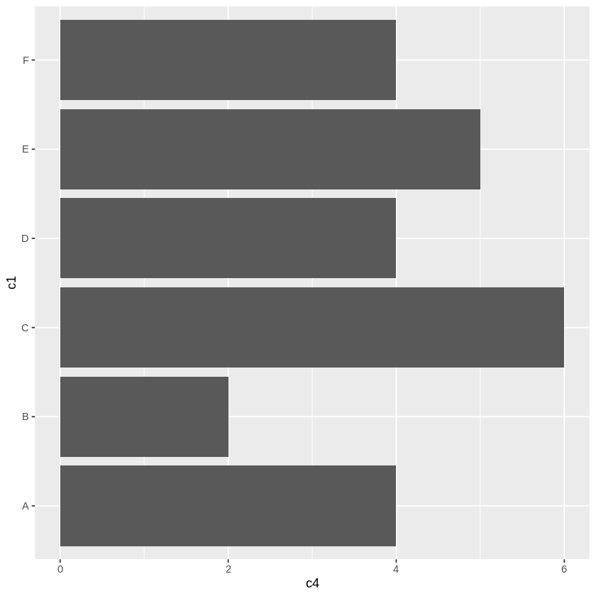
ggplot(df, aes(c1,c4)) + # 水平棒グラフ
geom_bar(stat="identity") + # stat="identity"は必須
coord_flip()
折線グラフ等で国別比較などをするには、X軸にの目盛りの間隔は等間隔であり、目盛りを質的データ("A","B" など)にする必要がありますが、
ggplot(df, aes(c1, c4)) + geom_line() ×
はエラーになります(line は x が数値であることが前提)。
そのため、次のように複雑な記述になります。
ggplot(df, aes(x=c(1:6), y=c4)) +                               #  X軸を等間隔にする必要がある
    geom_line() +
    scale_x_continuous(breaks=c(1:6),                           # 目盛りの位置
                       labels=c("A","B","C","D","E","F")) +     # labels = df$c1) でもよい
    theme(axis.text.x=element_text(size=20))                    # 目盛りの体裁はここで設定
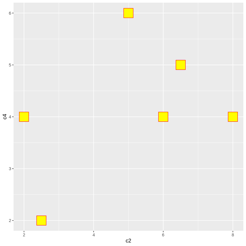
# 〓〓〓 散布図の点の形状、枠の色、塗りつぶしの色
ggplot(df, aes(c2, c4)) +
geom_point(shape=22, # 点の形状:「グラフ(レファレンス)」参照
size=10, # 点の大きさ
colour="red", # 点の囲みの色
fill="yellow") # 点内部の塗りつぶしの色
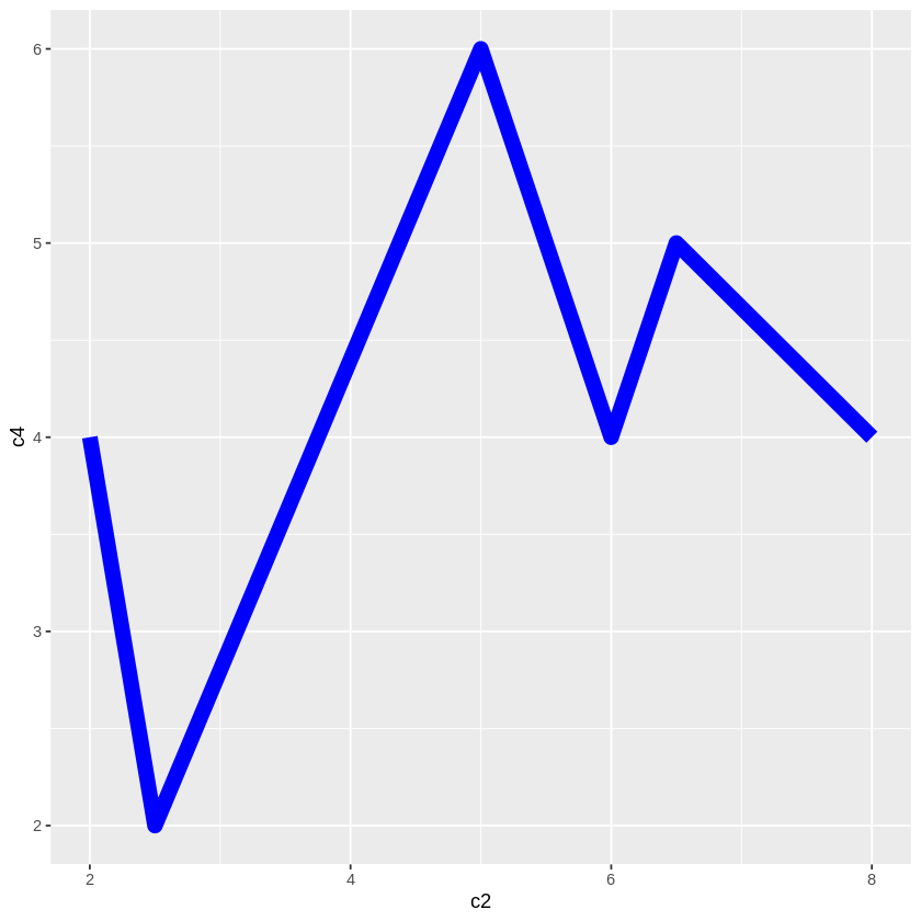
# 〓〓〓 折線の形状、太さ、色
ggplot(df, aes(c2, c4)) +
geom_line(linetype="solid", # 線形状:1(省略) "solid", 2 "dashed", 3 "dotted", 4 "dotdash", 5 "longdash", 6 "twodash"
size = 4,
colour="blue")
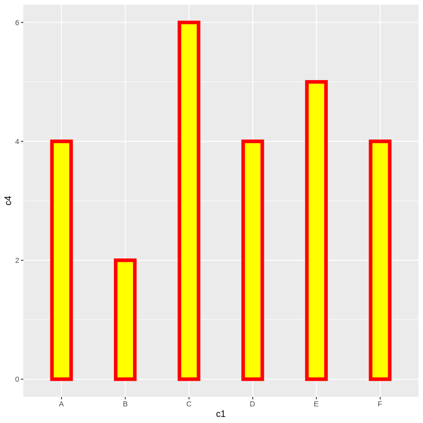
# 〓〓〓 棒グラフの色、枠の色、棒の幅
ggplot(df, aes(c1, c4)) +
geom_bar(stat="identity",
fill="yellow", # 棒の塗りつぶしの色
colour ="red", # 枠線の色
size=2, # 枠線の太さ
width=0.3) # 棒の幅(1にするとヒストグラム)
後述のように多様な関数があります。それを次のような順序で記述します。
ggplot( … ) +          # キャンバスの設定、X・Y軸の変数の指定など
    geom_xxxx( … ) +   # geom_line():折線グラフ、geom_bar():棒グラフなどの関数でグラフ作成
    theme_yyyyt( … )   # 多様な補助関数を用いて体裁を整える
xlim(xmin, xmax)
ylim(ymin, ymax)
# グラフの一部が欠けると Warning が出ますが、期待通りのグラフが得られます。
# 〓〓〓 水平・垂直線 hline, vline
# ===== 基本形
geom_hline(yintercept=seq(ymin, ymax, dy), # 垂直線を引く位置
           linetype=線形状,                # 1(省略) "solid", 2 "dashed", 3 "dotted", 4 "dotdash", 5 "longdash", 6 "twodash"
           color="blue",
           size=2))
geom_vline(xintercept=seq(xmin, xmax, dx), … ) # 水平線


# ===== X・Y軸線
geom_hline(yintercept=0, color="blue", size=2)) # 実線
geom_vline(xintercept=0, color="blue", size=2))


# =====  補助線
geom_hline(yintercept =seq(-2, 6, 1), linetype = "dashed")
geom_vline(xintercept =seq(-1, 7, 1), linetype = "dashed")


# 〓〓〓 任意の線
geom_segment(aes(x=2, y=2, xend=4, yend=5), # 必須
    arrow=arrow(),    # 矢印を付ける場合
    size=0.5,
    linetype=1,
    colour="black",
    alpha=1)

geom_abline(intercept=切片, slope=勾配) 一次式
# 〓〓〓 X・Y目盛り
# ===== 目盛り間隔の設定
scale_x_continuous(breaks=seq(xmin, xmax, dx))    # Y軸にときは x を y に変更

scale_x_continuous(breaks=seq(-2, 6, 1)) +
theme(axis.text= element_text(size=10))

# ===== 目盛りのデザイン
theme(axis.text.x = element_text(  # Y軸なら axis.text.x、両軸なら axis.text
    family="IPAMincho",   # フォントファミリー名
    face="plain",         # “plain”, “italic”, “bold” and “bold.italic”
    angle=50,             # 角度
    colour="red",
    size=16))

# ===== 折線グラフ等のX軸の目盛りを質的データ("A","B" など)にする

ggplot(df, aes(x=c(1:6), y=c4)) +                               #  X軸を等間隔にする必要がある
    geom_line() +
    scale_x_continuous(breaks=c(1:6),                           # 目盛りの位置
                       labels=c("A","B","C","D","E","F")) +     # labels = df$c1) でもよい
theme(axis.text.x=element_text(size=20))                        # 目盛りの体裁はここで設定

# 〓〓〓 X・Y軸ラベルとタイトル

# ===== ラベル文字列の変更(必要ならば)
xlab("x-axis")
ylab("y-axis")

# ===== タイトルの文字列
ggtitle("TITLE")

# ===== 文字列表示の体裁(基本形)
theme(axis.title.x=element_text(    # Y軸なら axis.title.x、両軸なら axis.title
    family="IPAMincho",   # フォントファミリー名
    face="plain",         # “plain”, “italic”, “bold” and “bold.italic”
    angle=50,             # 角度
    colour="red",
    size=16,
    hjust=0,              # 表示位置 0:左~1右 ┐
    vjust=0,              #          0:上~1下 ├ 軸ラベルで使うことはなかろう
    lineheight))          # 位置調整      ┘


# ===== X・Y軸ラベル例示
xlab("x-axis") + ylab("y-axis") +
theme(axis.title= element_text(colour="red", size=20))

theme(axis.title.y= element_text(colour="blue", size=40, angle=30))

theme(axis.title.y= element_text(colour="blue", size=40, angle=0, vjust=0.5))

# ===== タイトル例示
ggtitle("TITLE") +
    theme(plot.title = element_text(color="red", size=20, face="bold.italic", hjust=0.5)

# ===== タイトルと軸レベルを一括指定の例
ggtitle("TITLE") +
xlab("X-axis") + ylab("Y-axis") +
theme(
    plot.title = element_text(color="red", size=40, face="bold.italic", hjust=0.5),
    axis.title.x = element_text(color="blue", size=20),
    axis.title.y = element_text(color="blue", size=20))

# ===== 非表示にする
theme(
    plot.title = element_blank(),
    axis.title.x = element_blank(),
    axis.title.y = element_blank())
上記のオプションを適宜組み合わせると右図のように体裁を整えることができます。
(目盛りをXY軸の部分に移動させたいのですが、わかりませんでした)

library(ggplot2)

# 〓〓〓 入力データ
df <- data.frame(
  x = c( -2, -0.5,  1,   3.5,  4,  6),
  y = c( 1,  -1,    3,   1,  2,   1))

# 〓〓〓 折線グラフとグラフ表示範囲の設定
ggplot(df, aes(x,y)) + geom_line() +
   xlim(-2, 6) + ylim(-2, 4) +

# 〓〓〓 補助線
geom_hline(yintercept =seq(-2, 4, 0.5), linetype = "dashed") +
geom_vline(xintercept =seq(-2, 6, 1), linetype = "dashed")   +

# 〓〓〓 X・Y軸線
geom_hline(yintercept=0, color="blue",size=2) +
geom_vline(xintercept=0, color="blue",size=2) +

# 〓〓〓 任意の線
geom_segment(aes(x=-2, y=-1, xend=6, yend=2),    # 赤の線
    size=3, linetype=1, colour="red")   +

geom_abline(intercept=1, slope=1, colour="green", size=3) +  # 緑の線

# 〓〓〓 目盛りの設定
scale_x_continuous(breaks=seq(-2, 6, 1)) +
    theme(axis.text.x= element_text(size=20)) +

scale_y_continuous(breaks=seq(-2, 4, 1)) +
    theme(axis.text.y= element_text(size=20)) +

# 〓〓〓 タイトルと軸レベル
ggtitle("TITLE") +
xlab("X-axis") + ylab("Y-axis") +
theme(
    plot.title = element_text(color="red", size=40, face="bold.italic", hjust=0.5),
    axis.title.x = element_text(color="blue", size=30),
    axis.title.y = element_text(color="blue", size=30))
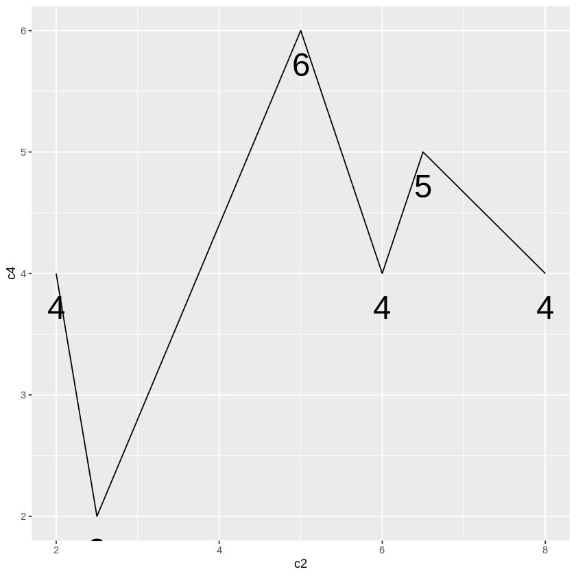
# ===== 折線の点
ggplot(df, aes(c2, c4)) +
    geom_line() +
    geom_text(aes(label=c4),       # label:書き込む値の変数
              vjust=2,             # 点からの下方変位
              size=10)             # 値の文字の大きさ
# ===== 棒グラフの棒上
ggplot(df, aes(c1, c4)) +
    geom_bar(stat="identity",
         width=0.8,
         colour="red",
         fill="yellow",
         position = "stack") +
    geom_text(aes(label=c4),
            vjust=2,              # 棒上部からの下方変位、負にすれば棒の上
            size=10)

# ===== 散布図の点を "A","B" にする
ggplot(df, aes(c2, c4)) +
    geom_point(size=0) +           # 点の大きさを0にして非表示に
    geom_text(aes(label=c1),       # c1 の値 "A","B" になる
              size=10)             # vjust を指定しないと点の位置に文字がくる


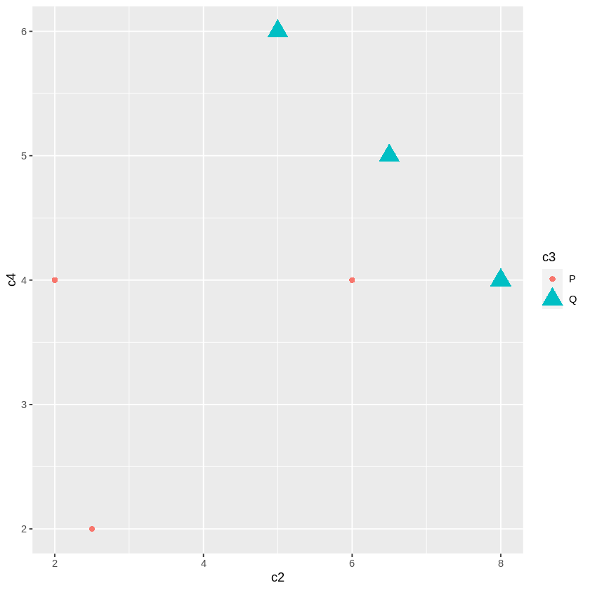
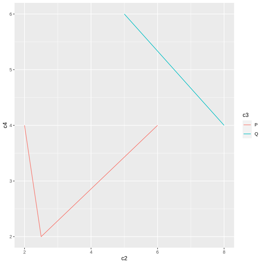
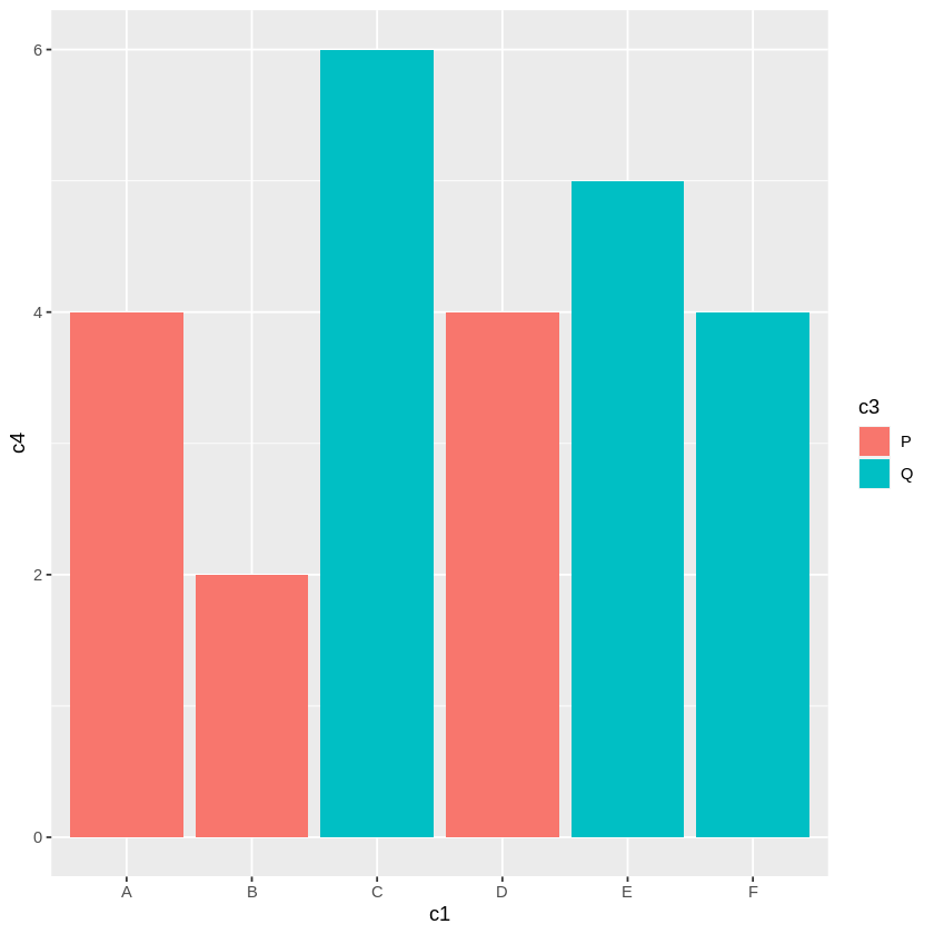
ggplot の特徴のある機能の一つに、各データに区分をつけておき(入力データの c3列の "P", "Q")、その区分により複数系列のグラフにする機能があります。group オプションで指定します。
    Pグループ   A(2, 4), B(2.5, 2), D(6, 4) の3データ
    Qグループ   C(5, 6), E(6.5, 5), F(8, 4) の3データ
重要なのは、color や fill が具体的な色を示すのではなく、groupの配列(c3)を指定することです。
システムは、group が P, Q などの group に自動的に割り当てられている色を用いるのです。そのため利用者が独自に色を設定することはできません(複雑になりそうです)。
この機能は、Rが統計的処理を重視しているからです。大量のデータがあり、それには、国別、性別、年齢別など多様な属性があり、それらの属性により、分布がどのように異なるかを比較することが多く、それには、この機能が適しているからです。
# ====== 散布図
ggplot(df) +
    aes(c2, c4,
    group=c3,        # 区分 P, Q を与えた列です。
    shape=c3,        # P, Q によりシステムが自動的に付けます(以下同じ)
    color=c3,          # color="red", color=c("red","blue") はエラーになります
    size=c3) +
    geom_point()
# ====== 折線グラフ
ggplot(df) + aes(c2, c4, group=c3, color=c3) + geom_line()  # size は推奨されていません

# ====== 棒グラフ
ggplot(df) + aes(c1, c4, group=c3, fill=c3) + geom_bar(stat="identity")
ggplotは、統計分野でのグラフ作成を重視しています。
ここで用いてきたデータでは、区分に関するデータは、c3 の p,q の1項目だけでした。それに対して実際のデータでは、国籍、性別、年齢、学歴など多数の区分項目があり、重複する属性を持つデータが多数あるのが通常です。
そのため、ある数量の項目をそのまま使うののではなく、それらの発生頻度、平均値、ばらつきなどを、区分項目での比較を調べることが必要になります。
最終的なグラフは point, line, bar などの形式であっても、数値の加工が必要になります。その過去を簡単にするために、オプションのパラメタや関数が容易されています。
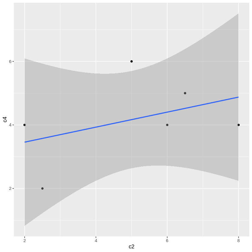
ggplot(df, aes(c2, c4)) +
    geom_point() +
    geom_smooth(
        method = "lm",       # lm(Linear Model、回帰分析)回帰直線を描きます。
        se = TRUE)           # se(標準偏差)信頼区間を描きます
method での lm は一次式 y = a + bx だけですが、method = "glm" とすると、glm(Generalized Linear Model,一般化線形モデル)が適用され、多様な確率統計分布を使うことができます。
geom_smooth(method = "glm",
            method.args = list(family = binomial(link = "logit")),
            se = FALSE)
method.args:適用する確率分布。
family:確率分布の分類。ここでは二項分布
link:説明変数の結合方式。ここではロジスティック関数
すなわち、説明変数 x をロジスティック関数で確率に変換し、その確率をパラメータとする二項分布に従い目的変数目的変数が生成されると考え、その値と被説明変数 y との一致を図ります。