スタートページ> JavaScript> 他言語> Python 目次> ←DataFrame のSQLライクな操作 →ヒストグラム
Python でグラフを作成するには、アドオンライブラリの Matplotlib を使います。
ここでは Matplotlib のコンポーネント matplotlib.pyplot を用います。
import matplotlib.pyplot as plt
Matplotlib 自体はデータの加工機能はもっていませんので、NumPy も使います。
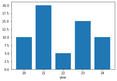
下記の青線の部分をGoogle Colaboratryの「コード」部分にコピーアンドペースト(ペーストは Cntl+V)して実行すれば、右図の画像が表示されます。
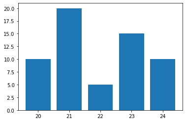
「いくつかの点の組 (x, y) を与えて棒グラフを描く」ことを例にして、グラフを描くための基本的な構造を示します。
import numpy as np
import matplotlib.pyplot as plt
# 入力データ
x = [20, 21, 22, 23, 24]
y = [10, 20,  5, 15, 10]
# figure生成する
fig = plt.figure()
# axをfigureに設定する
ax = fig.add_subplot(1, 1, 1)
# axesに棒グラフを設定する
ax.bar(x, y)
# オプションの追加
ax.set_xlabel('year')
# 表示する
plt.show()
x,y
    x 横軸の値のリスト
    y x に対応する値
  名称は任意です。
    x は連続量でなくてもかまいません。グラフもx の位置に表示されます。
    x は文字列でもかまいません。
fig = plt.figure()
    figure とは、キャンバスのようなものです。
axes
    axes とは「、matplotlibでは一つのグラフ領域と考えたほうが自然です。
ax = fig.add_subplot(1, 1, 1)
    決まり文句と考えてよいです。
  キャンパス(figure) には、複数のグラフ領域(axis)を設定できます。
    一般形:fig.add_subplot(行,列,場所)を表します。
        fig.add_subplot(2, 3, 5)
    とすると
       1 2 3
       4 ⑤ 6
    の6個のグラフ領域があり、その5番目の領域を対象にするという意味です。
        ax = fig.add_subplot(1, 1, 1)
  とは、キャンパスに1個のグラフ領域を設定し、ax という名前を付けるということです。
    決まり文句と考えてよいです。

・以降、このグラフ領域に関する指定には、axをサフィックスとします。
ax.bar(x, y)
  棒グラフであることを示します。
ax.set_xlabel('year')
    X軸のラベル
    オプションとして、多様な設定ができます。
plt.show()
  全グラフ領域を表示します。
グラフの表示範囲
  ax.set_xlim(xmin, xmax)
  ax.set_ylim(ymin, ymax)

グラフタイトル、軸ラベル表示
  ax.set_title('グラフタイトル', )
  ax.set_xlabel('X軸ラベル', options)
  ax.set_ylabel('Y軸ラベル', options)
      # options:
      #     fontsize=16
      #     color='r'

x 座標および y 座標の目盛り
  ax.tick_params(axis='x', colors='r')

  ax.tick_params(
      axis='x',        # 対象軸 x, y, both
      direction='out', # 目盛りと軸枠の位置 out,in, 9nout
      length=6,        # 目盛りの短線
      width=2,
      colors='r',
      grid_color='r',
      grid_alpha=0.5)

軸表示
  ax.hlines(y=0, xmin=xmin, xmax=xmax, options)   # 横線wo
  ax.vlines(x=0、ymin=ymin, ymax=ymax, options)   # 縦線
      # options:
      #     inestyles='dashed'
      #     linewidths=3
      #     colors='r'
     # y=[0,2,4]のような指定もできます。

グリッド
  ax.grid()

凡例
  ax.legend(loc=(u, v), ncol=1, frameon=False)  # 1, False のときは省略可能
      # u, v グラフ内での凡例枠の左下隅の位置。 左下隅 (0, 0)、右上隅を (1, 1)
      # ncol 凡例枠内の1行に表示する系列数
      # frameon=False 凡例に枠を付けない
  ax.legend(['y1','y2'], loc=(u, v),…) # 凡例の文字列を指定
文字列
  ax.text(x0, y0, "文字列", size = 15, color = "b") # (x0,y0) に文字列の左下
2点間を結ぶ直線
  ax.plot([x0,x1], [y0,y1], options)
      options:   # 通常の ax.plot と同じ
図形
  ax.add_patch(plt.Rectangle((x0, y0), width. height, options))  # 長方形
  ax.add_patch(plt.Polygon(((x0,y0),(x1,y1),(x2,x3)), options))  # 多角形
  ax.add_patch(plt.Circle((x0,y0),r,options))                    # 円
      options:
          fill=False         # 塗りつぶさない 省略時は True(塗りつぶす)
          facecolor='b'      # 内部の色
          alpha=0.2          # 透明度
          edgecolor='k'      # 枠線の色
          linestayle='solid' # 線の種類
          linewidth=2        # 枠線の太さ
  ax.bar(x, y, options)
      options
          width=0.5,                 # 棒の太さを細く
          color=['y', 'c', 'g','r','b'],  # 棒の色 個別指定
          edgecolor='b',             # 棒の枠線の色
          linewidth=4,               # 棒の枠線の太さ
          align='center'/'edge'      # 省略時は'center'、棒の中央に目盛り
                          # 'edge:width>0 棒の左端, <0 右端に目盛り
                                     #     複数グラフのときに使う
  ax.plot(x,y, option1, options)
      option1は、線あるいは点の色と形状をまとめたものです。
          色:r, b, g, c, m, y, w, k(黒:デフォルト)
         形状:線: -(実線:デフォルト), --(破線), -.(一点鎖線), :(点線)
                点: . o s(四角) hH(5角形) cD(ダイヤ)  * + x v ^ < >
         →例 'bo:' 青い〇点と青い点線
       otions の形式でも設定できます。
         color/c='black'   # 色、'ff0000' など多様な形式が可能
         alpha=0           # 透明度
         linestyle/ls      # 線の形状 上の記号だけでなく 'solid','dash' なども使える
         linewidth/lw=1    # 線の太さ
         markersize/ms=2   # 点の大きさ
積上げ折線グラフで範囲を塗りつぶす。
  ax.fill_between(x, y1,y2, color='r', alpha=0.3)  # y1とy2のの間を塗りつぶす。
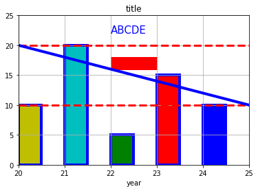
import numpy as np
import matplotlib.pyplot as plt
# 入力データ
x = [20, 21, 22, 23, 24]
y = [10, 20,  5, 15, 10]
# figure生成
fig = plt.figure()
# axをfigureに設定する
ax = fig.add_subplot(1, 1, 1)
# ax,bar でのオプション
ax.bar(x, y,
       width=0.5,                 # 棒の太さを細く
       color=['y', 'c', 'g','r','b'],  # 棒の色 個別指定
       edgecolor='b',             # 棒の枠線の色
       linewidth=4,               # 棒の枠線の太さ
       align='edge'               # 棒の左端に目盛り
      )
# オプションの追加
ax.set_xlim(20, 25)    # グラフの表示範囲
ax.set_ylim(0, 25)
ax.set_title('title')  # グラフタイトル
ax.set_xlabel('year')  # X軸ラベル
ax.grid()              # グリッド
ax.hlines(y=[10,20], xmin=20, xmax=35,
          color='r', linestyles='dashed', linewidths=3)   # 横の赤い破線
# 追加画像
ax.text(22, 22, 'ABCDE', size = 15, color = "b")          # ABCDE の文字列
ax.plot([20,25], [20,10], 'b-', lw=4)                     # 右下がりの青線
ax.add_patch(plt.Rectangle((22, 16), 1, 2, color='r'))    # 赤い横長長方形
# グラフ表示
plt.show()
Pandas の DataFrame(df)から直接にグラフを作成することができます。
Matplotlibでは、ax.sum や ax,plot のようにグラフの種別になっていますが、Pandas では、一つの df.plot のパラメタで指定できます。
オプションでは、df を用いた場合でも matplotlib.pyplot の ax が使えますが、df.plot でもそれに同等以上のオプション機能があります。
df を用いるときは、これを用いるほうが便利です。
df.plot のパラメタに
table=True,
xticks=[],
があります。これにより、X軸の下にyの値の表が表示されます。
グラフに値を入れるのは困難なので、これは便利な機能です。
import numpy as np
import matplotlib.pyplot as plt
import pandas as pd         # df を使うので必要
df = pd.DataFrame([         #     x  y1  y2
            [20,10,20],     # 0  20  10  20
            [21,20,50],     # 1  21  20  50
            [22, 5,35],     # 2  22   5  35
            [23,15,30],     # 3  23  15  30
            [24,10,10]],    # 4  24  10  10
            columns = ['x','y1','y2'])
fig = plt.figure()
ax = df.plot(x='x', y='y1')    # ax.plot(x,y) に相当
      # fig内のグラフが1個だけのときは
      #     ax = fig.add_subplot(1, 1, 1)
      #     df.plot(x='x', y='y1', ax=ax)
      # をこのように1行にしたほうが便利です。
ax.set_xlabel('year')           # axのオプションはそのまま使える
plt.show()
ax = df.plot(…) の行を変更するだけで、多様なグラフにすることができます。

x軸が行番号のとき
  ax = df.plot(y='y1')   # x='x' を与えない
複数グラフのとき
  ax = df.plot(x='x', y=['y1', 'y2'])
積上げグラフのとき
  df.plot(x='x', y=['y1','y2', staked=True)
xを文字列(20,21,… を 'A','B',… など)にすることも可能です。

●df.plot の主要なパラメタ

  df.plot(kind=, x=, y=, options)
    options:
      kind = 'line'             # グラフの種類
                      # bar, barh, hist, box, kde, density, area, pie, scatter, hexbin
      x='x'                     # x軸 省略のときは列番号
      y = 'y'/['y1','y2',…]    # y軸

      ax=None                   # ax = df.plot(~) グラフの情報、グラフの上書きに用いる
      table=True                # グラフの下に数表を表示 xticks=[] とすること
      title='title'             # グラフのタイトル
      grid=True                 # グリッド線
      legend=False              # 凡例。省略時は表示(True)
      figsize=(20,10)           # figのサイズ。インチ単位。省略時は自動
      color = 'r'
      width = 0.8               # 棒の幅
      xlim=[-2, 2]              # x軸の表示幅
      ylim=[-2, 2]              # y軸の表示幅
      xticks=[-2,-1,0,1,2]      # x軸の目盛り
      yticks=[-2,-1,0,1,2]      # y軸の目盛り
      fontsize=20               # 目盛りのフォント
      secondary_y=True          # y2軸の指定

      style='solid'             # 線の形状 Matplotlibと同じ
      colormap='viridis'        # カラーマップ Matplotlibと同じ
      colorbar='k'              # 棒グラフでの枠線の色
      position=0.5              # 棒グラフでの目盛りの位置、0=棒の左端 1=右端
      stacked=True              # 棒グラフでの積上げ
例3を棒グラフにしました。 ax = df.plot() に kind = 'bar' を追加するだけです。
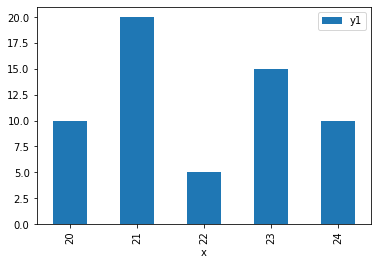
import numpy as np
import matplotlib.pyplot as plt
import pandas as pd         # df を使うので必要
df = pd.DataFrame([         #     x  y1  y2
            [20,10,20],     # 0  20  10  20
            [21,20,50],     # 1  21  20  50
            [22, 5,35],     # 2  22   5  35
            [23,15,30],     # 3  23  15  30
            [24,10,10]],    # 4  24  10  10
            columns = ['x','y1','y2'])
fig = plt.figure()
ax = df.plot(x='x', y='y1', kind = 'bar')    # 棒グラフ
plt.show()
import numpy as np
import matplotlib.pyplot as plt
import pandas as pd # df を使うので必要
df = pd.DataFrame([ # x y1 y2
[20,10,20], # 0 20 10 20
[21,20,50], # 1 21 20 50
[22, 5,35], # 2 22 5 35
[23,15,30], # 3 23 15 30
[24,10,10]], # 4 24 10 10
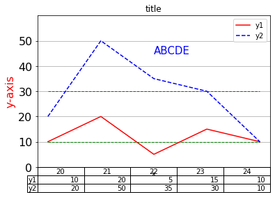
columns = ['x','y1','y2'])
fig = plt.figure()
ax = df.plot(x='x', y=['y1', 'y2'], # 複合折線グラフ
# plot 内のオプション
table=True, # グラフの下に数表を表示
title='title', # グラフのタイトル
ylim=[0, 60], # y軸の表示幅
yticks=[0,10,20,30,40,50], # y軸の目盛り
xticks=[], # x軸の目盛り table=True のときは非表示にする
grid=True, # グリッド線
fontsize=16, # 目盛りのフォント
style=['r-','b--'], # 線の形状 Matplotlibと同じ
)
# ax でのオプション
ax.set_ylabel('y-axis', fontsize=16, color='r') # Y軸ラベル
ax.hlines(y=[10,30], xmin=20, xmax=24,
color='g', linestyles='dashed', linewidths=1) # 横の赤い破線
ax.text(22, 45, 'ABCDE', size = 15, color = "b") # ABCDE の文字列
# グラフ表示
plt.show()
import numpy as np
import matplotlib.pyplot as plt
# 入力データ
x = [20, 21, 22, 23, 24]
y = [10, 20,  5, 15, 10]
# figure生成
fig = plt.figure()
# axをfigureに設定する
ax = fig.add_subplot(1, 1, 1)
# axesに棒グラフを設定する
ax.bar(x, y)
# 表示する
plt.show()
  ax.box(x,y, options)
      width=0.8                 # 棒の太さ
      color='k'                 # 棒の色
      alfa=0                    # 透明度
      edgecolor=None            # 棒の枠線の色
      linewidth/lw=None         # 棒の枠線の太さ
      align="center"/"edge"     # 棒の位置
      bottom=None               ymin
     color、edgecolor、linewidth、#  [配列] の形式で指定できます。
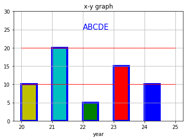
import numpy as np
import matplotlib.pyplot as plt
x = [20, 21, 22, 23, 24]
y = [10, 20,  5, 15, 10]
fig = plt.figure()
ax = fig.add_subplot(1, 1, 1)
# 棒のオプション
ax.bar(x, y,
    width=0.5,                 # 棒の太さを細く
    color=['y', 'c', 'g','r','b'],  # 棒の色 個別指定
    edgecolor='b',             # 棒の枠線の色
    linewidth=4,               # 棒の枠線の太さ
    align="edge"               # 棒を目盛りの右側
    )
# 棒以外のオプション
ax.set_ylim(0, 30)
ax.set_xlabel('year')          # x軸ラベル
ax.set_title('x-y graph')      # タイトル表示
ax.hlines(y=[10, 20], xmin=20, xmax=25, colors='r', linewidths=1) # 横軸 y = 10,20 に赤線
ax.grid()                      # グリッド線
ax.text(22, 25, "ABCDE", size = 15, color='b')              # 文字の挿入
# 表示する
plt.show()
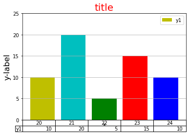
import numpy as np
import matplotlib.pyplot as plt
import pandas as pd         # df を使うので必要
df = pd.DataFrame([         #     x  y1  y2
            [20,10,20],     # 0  20  10  20
            [21,20,50],     # 1  21  20  50
            [22, 5,35],     # 2  22   5  35
            [23,15,30],     # 3  23  15  30
            [24,10,10]],    # 4  24  10  10
            columns = ['x','y1','y2'])
fig = plt.figure()
ax = df.plot(x='x', y='y1', kind = 'bar',    # kind = 'bar'で棒グラフ
         table=True,               # グラフの下に数表を表示 xticks=[] とすること
         xticks=[],                # x軸の目盛りをしない
         width = 0.8,              # 棒の太さ
         color=['y', 'c', 'g','r','b'],   # 棒グラフでの枠線の色
         position=0.5,             # 棒グラフでの目盛りの位置、0=棒の左端 1=右端
         ylim=[0, 25],             # y軸の表示幅
         grid=True
       )
ax.set_title('title', fontsize=20, color='r')
ax.set_ylabel('y-label', fontsize=16)
plt.show()
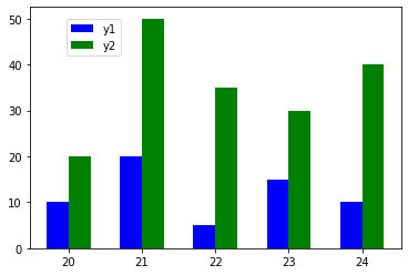
import matplotlib.pyplot as plt
x  = [20, 21, 22, 23, 24]
y1 = [10, 20,  5, 15, 10]
y2 = [20, 50, 35, 30, 40]
fig = plt.figure()
ax = fig.add_subplot(1, 1, 1)
w = 0.3
ax.bar(x, y1, color='b', width=-w, align='edge', label='y1') # 目盛りの左側
ax.bar(x, y2, color='g', width= w, align='edge', label='y2') # 目盛りの右側
ax.legend(loc=(0.1, 0.8))
plt.show()
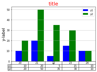
import numpy as np
import matplotlib.pyplot as plt
import pandas as pd
df = pd.DataFrame([         #     x  y1  y2
            [20,10,20],     # 0  20  10  20
            [21,20,50],     # 1  21  20  50
            [22, 5,35],     # 2  22   5  35
            [23,15,30],     # 3  23  15  30
            [24,10,10]],    # 4  24  10  10
            columns = ['x','y1','y2'])
fig = plt.figure()
ax = df.plot(x='x', y=['y1','y2'], kind = 'bar',  # 単一をy=['y1','y2']にしただけ
         table=True,               # グラフの下に数表を表示 xticks=[] とすること
         xticks=[],                # x軸の目盛りをしない
         width = 0.8,              # 棒の太さ
         color=['b', 'g'],         # 棒グラフでの枠線の色
         grid=True
       )
ax.set_title('title', fontsize=20, color='r')
ax.set_ylabel('y-label', fontsize=16)
plt.show()
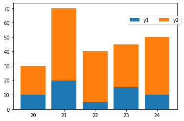
import numpy as np
import matplotlib.pyplot as plt
x  = [20, 21, 22, 23, 24]
y1 = [10, 20,  5, 15, 10]
y2 = [20, 50, 35, 30, 40]
fig = plt.figure()
ax = fig.add_subplot(1, 1, 1)
w = 0.8
ax.bar(x,y1, width=w, label='y1')
ax.bar(x,y2, width=w, label='y2', bottom=y1)
   # widthを同じにする。p2の棒の0点をp1の高さにして積上げる
ax.legend(loc=(0.7, 0.8), ncol=2)  # 凡例を1行2変数にした
plt.show()
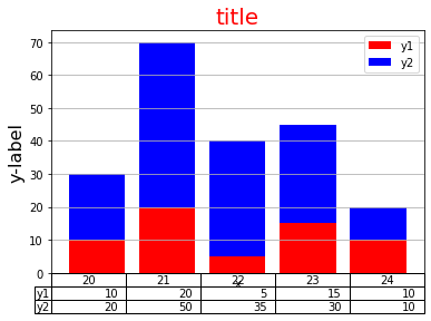
import numpy as np
import matplotlib.pyplot as plt
import pandas as pd         # df を使うので必要
df = pd.DataFrame([         #     x  y1  y2
            [20,10,20],     # 0  20  10  20
            [21,20,50],     # 1  21  20  50
            [22, 5,35],     # 2  22   5  35
            [23,15,30],     # 3  23  15  30
            [24,10,10]],    # 4  24  10  10
            columns = ['x','y1','y2'])
fig = plt.figure()
ax = df.plot(x='x', y=['y1','y2'], kind = 'bar',
         stacked=True,             # 積上げることを示す ★複数棒グラフとの違い
         table=True,               # グラフの下に数表を表示 xticks=[] とすること
         xticks=[],                # x軸の目盛りをしない
         width = 0.8,              # 棒の太さ
         color=['r', 'b'],         # y1, y2 の棒の色
         grid=True
       )
ax.set_title('title', fontsize=20, color='r')
ax.set_ylabel('y-label', fontsize=16)
plt.show()
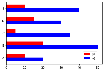
import numpy as np
import matplotlib.pyplot as plt
x  = ['A', 'B', 'C', 'D', 'E']     # A が下、E が上になる
y1 = [10, 20,  5, 15, 10]
y2 = [20, 50, 35, 30, 40]
fig = plt.figure()
ax = fig.add_subplot(1, 1, 1)
h = 0.3
ax.barh(x, y1, color='r', height= h, align='edge', label='y1') # y1 が上になる
ax.barh(x, y2, color='b', height=-h, align='edge', label='y2')
ax.legend(loc=(0.8, 0.05))
plt.show()
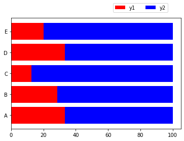
import numpy as np
import numpy as np
import matplotlib.pyplot as plt
x  = ['A', 'B', 'C', 'D', 'E']     # A が下、E が上になる
y1 = np.array([10, 20,  5, 15, 10])  # 列方向の計算をするので ndarray にする
y2 = np.array([20, 50, 35, 30, 40])
z = y1 + y2
z1 = y1/z*100
z2 = y2/z*100
       # 以降は水平グラフの積上げグラフになる
fig = plt.figure()
ax = fig.add_subplot(1, 1, 1)
h = 0.8
ax.barh(x, z1, color='r', height= h, align='center', label='y1')
ax.barh(x, z2, color='b', height=-h, align='center', label='y2', left=z1) # left=z1  z1 の右に z2
ax.legend(loc=(0.6, 1.05), ncol=2)     # y0 >1 なのでグラフの上に表示される
plt.show()
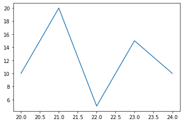
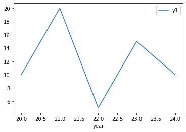
import numpy as np
import matplotlib.pyplot as plt
# 入力データ
x = [20, 21, 22, 23, 24]
y = [10, 20,  5, 15, 10]
# figure生成する
fig = plt.figure()
# axをfigureに設定する
ax = fig.add_subplot(1, 1, 1)
# axesにグラフを設定する
ax.plot(x, y)
# 表示する
plt.show()
  二つのオプション記述になります。
  ax.plot(x,y, option1, option2)
      option1:線あるいは点の色と形状をまとめたものです。
          色:r, b, g, c, m, y, w, k(黒:デフォルト)
         形状:線: -(実線:デフォルト), --(破線), -.(一点鎖線), :(点線)
                点: . o s(四角) hH(5角形) cD(ダイヤ)  * + x v ^ < >
         'bo:' 青い〇点と青い点線 このように一つの引数にまとめます。
       option2:細かい指定を名前付き引数で与えます
         color/c='black'   色、'ff0000' など多様な形式が可能
         alpha=0           透明度
         linestyle/ls      線の形状 上の記号だけでなく 'solid','dash' なども使える
         linewidth/lw=1    線の太さ
         markersize/ms=2   点の大きさ
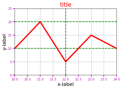
import numpy as np
import matplotlib.pyplot as plt
# 入力データ
x = [20, 21, 22, 23, 24]
y = [10, 20,  5, 15, 10]
# figureの生成
fig = plt.figure()
# axをfigureに設定する
ax = fig.add_subplot(1, 1, 1)

# グラフの設定
ax.plot(x, y,
        'ro-',           # option1 赤色、点は〇、実線
         linewidth=4,    # option2 線の太さ
         markersize=2    #         点の大きさ
       )

# グラフ以外のオプション付加
ax.set_xlim(20, 24)                            # グラフの表示範囲
ax.set_ylim(0, 25)
ax.set_title('title', fontsize=20, color='r')  # グラフタイトル、軸ラベル表示
ax.set_xlabel('x-label', fontsize=16)          # X軸ラベル
ax.set_ylabel('y-label', fontsize=16)
ax.tick_params(axis='both',                    # 対象軸 x, y, both
    length=6,                                  # 目盛り
    width=2,
    colors='m')
ax.grid()                                      # グリッド
ax.hlines(y=[10,20], xmin=20, xmax=24,         # 緑の破線
          linestyles='dashed',
          linewidths=2,
          colors='g')
ax.vlines(x=22, ymin=0, ymax=25, linestyles='dashed', linewidths=2, colors='g')

# 表示する
plt.show()
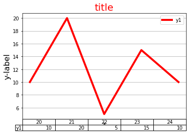
import numpy as np
import matplotlib.pyplot as plt
import pandas as pd
df = pd.DataFrame([         #     x  y1  y2
            [20,10,20],     # 0  20  10  20
            [21,20,50],     # 1  21  20  50
            [22, 5,35],     # 2  22   5  35
            [23,15,30],     # 3  23  15  30
            [24,10,10]],    # 4  24  10  10
            columns = ['x','y1','y2'])
fig = plt.figure()
ax = df.plot(x='x', y='y1',        # kind を省略すると折線グラフ
         table=True,               # グラフの下に数表を表示 xticks=[] とすること
         xticks=[],                # X軸ラベルを表示しない
         color='r',                # 線の色
         linewidth=4,              # 線の太さ
         grid=True                 # グリッド
       )
ax.set_title('title', fontsize=20, color='r')
ax.set_ylabel('y-label', fontsize=16)
plt.show()
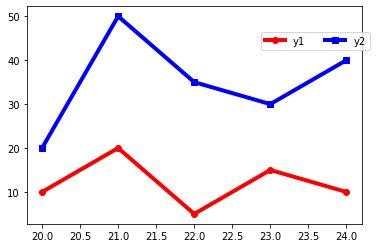
import numpy as np
import matplotlib.pyplot as plt
x  = [20, 21, 22, 23, 24]
y1 = [10, 20,  5, 15, 10]
y2 = [20, 50, 35, 30, 40]
fig = plt.figure()
ax = fig.add_subplot(1, 1, 1)
ax.plot(x,y1, 'ro-', linewidth=4, label='y1')
ax.plot(x,y2, 'bs-', linewidth=4, label='y2')   # グラフの数だけ記述
ax.legend(loc=(0.7, 0.8), ncol=2)               # 凡例を1行2変数にした
plt.show()
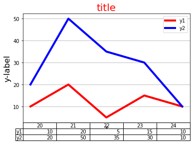
import numpy as np
import matplotlib.pyplot as plt
import pandas as pd
df = pd.DataFrame([         #     x  y1  y2
            [20,10,20],     # 0  20  10  20
            [21,20,50],     # 1  21  20  50
            [22, 5,35],     # 2  22   5  35
            [23,15,30],     # 3  23  15  30
            [24,10,10]],    # 4  24  10  10
            columns = ['x','y1','y2'])
fig = plt.figure()
ax = df.plot(x='x', y=['y1', 'y2'],   # 単一グラフに★の部分を[ ]にしただけ
         table=True,                  # グラフの下に数表を表示 xticks=[] とすること
         xticks=[],                   # X軸ラベルを表示しない
         color=['r', 'b'],            # ★ 線の色
         linewidth=4,                 # 線の太さ
         grid=True                    # グリッド
       )
ax.set_title('title', fontsize=20, color='r')
ax.set_ylabel('y-label', fontsize=16)
plt.show()
積上げるグラフを y1+y2 にすれば、単なる複数折線グラフになります。
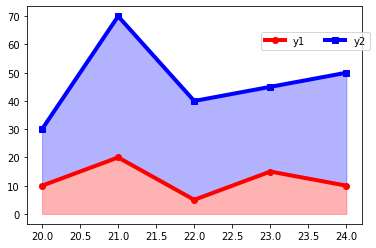
import numpy as np
import matplotlib.pyplot as plt
x  = np.array([20, 21, 22, 23, 24])
y1 = np.array([10, 20,  5, 15, 10])                 # y1+y2 をするために ndarray にする
y2 = np.array([20, 50, 35, 30, 40])
fig = plt.figure()
ax = fig.add_subplot(1, 1, 1)
ax.plot(x,y1,    'ro-', linewidth=4, label='y1')
ax.plot(x,y1+y2, 'bs-', linewidth=4, label='y2')    # y1+y2 のグラフ
ax.fill_between(x,  0,y1,    color='r', alpha=0.3)  # グラフ間を塗りつぶす
ax.fill_between(x, y1,y1+y2, color='b', alpha=0.3)
ax.legend(loc=(0.7, 0.8), ncol=2)
plt.show()
import numpy as np
import matplotlib.pyplot as plt
import pandas as pd
df = pd.DataFrame([         #     x  y1  y2
            [20,10,20],     # 0  20  10  20
            [21,20,50],     # 1  21  20  50
            [22, 5,35],     # 2  22   5  35
            [23,15,30],     # 3  23  15  30
            [24,10,10]],    # 4  24  10  10
            columns = ['x','y1','y2'])
fig = plt.figure()
ax = df.plot(x='x', y=['y1','y2'],
         stacked=True,             # 積上げることを示す ★複数棒グラフとの違い
         table=True,               # グラフの下に数表を表示 xticks=[] とすること
         xticks=[],                # x軸の目盛りをしない
         color=['r', 'b'],         # y1, y2 の線の色
         linewidth=4,              # 線の太さ
         grid=True
       )
ax.set_title('title', fontsize=20, color='r')
ax.set_ylabel('y-label', fontsize=16)
plt.show()
y = f(x) により、配列 x の各点における y の値が計算できます。
x(横軸)の刻みを細かくすれば、滑らかな曲線になります。
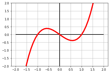
import numpy as np
import matplotlib.pyplot as plt

# 入力データ
xmin = -2    # x の表示範囲
xmax =  2
dx = 0.1     # x の刻み幅 小さくすると時間がかかるが滑らかになる
ymin = -2    # y の表示範囲
ymax =  2
# y配列の作成
x = np.arange(xmin, xmax+dx, dx)  # x=xmax のときも対象にしたいので
y = x*(x-1)*(x+1)

# figure生成する
fig = plt.figure()
# axをfigureに設定する
ax = fig.add_subplot(1, 1, 1)

# グラフを作る
ax.plot(x, y, 'r-', lw=4)
# オプションの追加
ax.set_ylim(ymin, ymax)
ax.hlines(y=0, xmin=xmin, xmax=xmax, linewidths=2) # x軸を引く
ax.vlines(x=0, ymin=ymin, ymax=ymax, linewidths=2)
ax.grid()

# 表示する
plt.show()
棒グラフをグラフ1とし、目盛りなどは左側(y1軸)にします。
折線グラフをグラフ2とし、目盛りなどは左側(y2軸)にします。
ax1 棒グラフ
fig, ax1 = plt.subplots() # 次の2ステップをまとめたものです
fig = plt.figure()
ax1 = fig.add_subplot(1,1,1)
ax2 で折線グラフ
ax2 = ax1.twinx()
twinx() は、既存ax(ax1)にx軸を共通にした新ax(ax2)を生成する機能です。
ここで設定したy軸はy2軸になります。
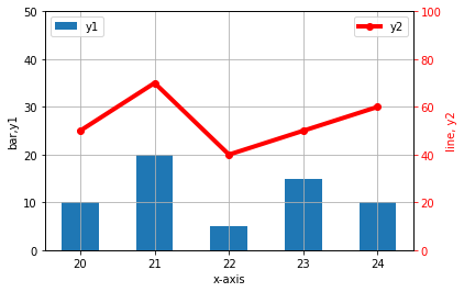
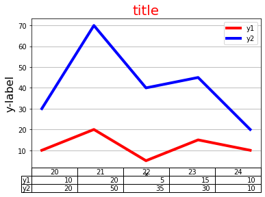
import numpy as np
import matplotlib.pyplot as plt
# 入力データ
x  = [20, 21, 22, 23, 24]
y1 = [10, 20,  5, 15, 10]    # グラフ1(棒グラフ)
y2 = [50, 70, 40, 50, 60]    # グラフ2(折線グラフ)
# グラフ1
fig, ax1 = plt.subplots()
ax1.bar(x,y1, width=0.5)             # 棒グラフ
ax1.set_ylim(0, 50)                  # y1軸の範囲
ax1.set_ylabel('bar,y1')             # y1軸ラベル
ax1.legend(['y1'], loc='upper left') # 凡例を左上に
# グラフ2
ax2 = ax1.twinx()
ax2.plot(x,y2, 'ro-', linewidth=4)
ax2.set_ylim(0, 100)
ax2.set_ylabel('line, y2', color='r')
ax2.tick_params(axis='y', colors='r') # 軸目盛りを赤に
ax2.legend(['y2'], loc='upper right') # 凡例を右上に
# 共通事項
ax1.set_xlabel('x-axis')              # X軸ラベル
ax1.grid()                            # グリッド
# グラフ表示
plt.show()
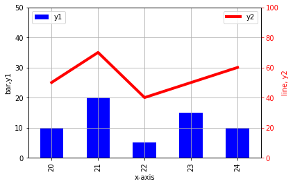
import numpy as np
import matplotlib.pyplot as plt
import pandas as pd
df = pd.DataFrame([         #     x  y1  y2
            [20,10,50],     # 0  20  10  50
            [21,20,70],     # 1  21  20  70
            [22, 5,40],     # 2  22   5  40
            [23,15,50],     # 3  23  15  50
            [24,10,60]],    # 4  24  10  60
            columns = ['x','y1','y2'])
fig = plt.figure()
# グラフ1
ax1 = df.plot(x='x', y='y1', kind='bar',
              ylim=[0, 50],          # y1軸の範囲
              color='b'
             )
ax1.set_ylabel('bar,y1')             # y1軸ラベル
ax1.legend(['y1'], loc='upper left') # 凡例を左上に
# グラフ2
ax2 = ax1.twinx()
df.y2.plot(x='x',                    # df.plot(y='y2',…) ではグラフが出ない(原因不明)
           ax=ax2,                   # y2軸を用いる
           ylim=[0,100],             # y2軸の範囲
           color='r',
           linewidth=4
          )
ax2.set_ylabel('line, y2', color='r') # y2軸ラベル
ax2.tick_params(axis='y', colors='r') # 軸目盛りを赤に
ax2.legend(['y2'], loc='upper right') # 凡例を右上に
# 共通事項
ax1.grid()                            # グリッド
ax1.set_xlabel('x-axis')              # X軸ラベル
# グラフ表示
plt.show()